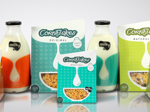
I chose this line of packaging as an example of good design. It was designed by Matija Blagojevic, a graphic design student from Serbia. When I came across this packaging, I thought it was a great design, very modern and clean. The package I want to focus on specifically is the CornFlakes Original cereal package. Below are a few of examples of the Gestalt Principles I noticed in this package.
- Simplicity: This cereal package is very clean and simple. There aren't too many colors going on, and there are only a few objects in the design as well.
- Proximity: You can see the diamond shape pattern in the background. This is an example of proximity. Each of the diamond shapes are placed close enough together to create a pattern.
- Similarity: If you look closely, you can see that the two circle shapes in each corner ("organic food" & "300g") are the same exact circle, just opposite colors.


No comments:
Post a Comment