Here is an ordinary cereal box, "Cheerios". In my opinion, this is an example of bad design, especially when compared to the new and modern design of "Milky". A few reasons why I think this Cheerios box is bad design are...
- There are too many objects competing against each other. When I first looked at the box, my eye kept jumping back between the "Free Gratuit", the "Cheerios" heading, and the "1g of sugar". Then you also have the picture of yogurt on the side which is distracting to the product.
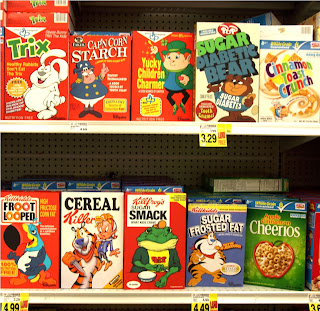
- I feel that the overall feel and color scheme of the package does not stand out from it's competitors. To the right is a photo of the cereal section at a grocery store. Notice how similar all of the cereal boxes look in terms of color, size, graphics, etc.


No comments:
Post a Comment