Monday, February 18, 2013
Valentine's Day
This was just a cute printable of subway art I found online for Valentines Day. I thought it was very bright and happy!
Saturday, February 2, 2013
Design Evaluation - "Milky" Packaging

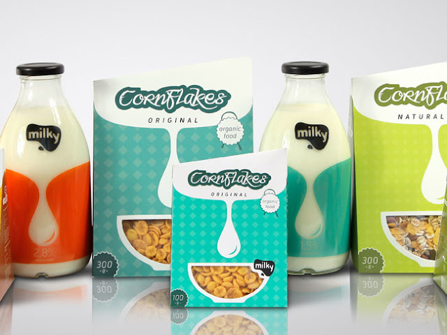
I chose this line of packaging as an example of good design. It was designed by Matija Blagojevic, a graphic design student from Serbia. When I came across this packaging, I thought it was a great design, very modern and clean. The package I want to focus on specifically is the CornFlakes Original cereal package. Below are a few of examples of the Gestalt Principles I noticed in this package.
- Simplicity: This cereal package is very clean and simple. There aren't too many colors going on, and there are only a few objects in the design as well.
- Proximity: You can see the diamond shape pattern in the background. This is an example of proximity. Each of the diamond shapes are placed close enough together to create a pattern.
- Similarity: If you look closely, you can see that the two circle shapes in each corner ("organic food" & "300g") are the same exact circle, just opposite colors.
Design Evaluation - "Cheerio's"
Here is an ordinary cereal box, "Cheerios". In my opinion, this is an example of bad design, especially when compared to the new and modern design of "Milky". A few reasons why I think this Cheerios box is bad design are...
- There are too many objects competing against each other. When I first looked at the box, my eye kept jumping back between the "Free Gratuit", the "Cheerios" heading, and the "1g of sugar". Then you also have the picture of yogurt on the side which is distracting to the product.
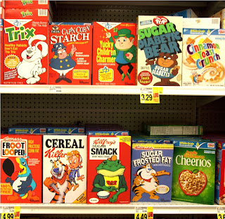
- I feel that the overall feel and color scheme of the package does not stand out from it's competitors. To the right is a photo of the cereal section at a grocery store. Notice how similar all of the cereal boxes look in terms of color, size, graphics, etc.

Subscribe to:
Comments (Atom)


