 |
| Sketches |
 |
Rough Logo |
 |
Style Guide
|
 |
Final Logo |
 |
| Before & After |

There were approximately 30 different people who worked on the make-up design for the Wizard of Oz, but the main Makeup Artist was Jack Dawn. He was in the industry for 37 years. One of his first creations was a stiff, uncomfortable mask he wore in the role of ape in 1925. In order to make masks that were more elastic and lifelike, he began to experiment with a variety of materials. After nine years of research while working at MGM, he developed a synthetic plastic he called vinylite resin for which he received a patent. Its first application was used to create the Chinese faces for the mostly white cast of The Good Earth in 1937.

Two years later, Dawn was assigned the task of giving life to three non-human characters - a scarecrow, a tin man, and a lion - in MGM's now-classic musical film The Wizard of Oz. He also created the green makeup for Wicked Witch of the West and multiple looks for Frank Morgan, who portrayed five different characters in the film, as well as for the Munchkins. His work resulted in some of the most recognizable makeup designs ever created for a Hollywood production.
Because of the extravagant make-up in the movie, the studio recruited several employees from the studio's mailroom and courier service to help apply make-up to the cast. A lot of the make-up involved prosthetics, so the employees were trained on one area of prosthetics and they formed an assembly line.
Although the make-up in the film received a lot of recognition, there was also a lot of accidents on set, some of which involved the make-up. For example, the Tin Man was originally played by Buddy Esben. However, due to aluminum dust in the make-up, Esben was unable to breathe and was rushed to the hospital. Jack Haley was then cast as the Tin Man and took over for Buddy Esben. The make-up was changed from aluminum dust to aluminum paste.
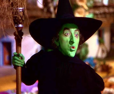
Another accident involved Margaret Hamilton who played the Wicked Witch of the West. In the scene where she leaves munchkin land through a cloud of smoke and fire, there was an accident which caused her to get burned. The make-up that she wore for the film was made out of copper. Her face and hands were left with second and third degree burns. Thankfully a friend on the set helped Margaret get the make-up off quickly, otherwise the heated up copper would have continued to eat away at her face. See video below.
CBS - Behind the Scenes of the Wizard of Oz... by videohollic
This is a photo I took today outside of my house with my iphone. Believe it or not that sun glare is real! The sun was just setting and when I took the photo with my Nikon, I didn't get that cool sun glare, so I started taking some with my phone and I liked how it looked better!
I decided to photograph the tree on the right side of the frame, which uses the rule of thirds. If I would have photographed it from straight on, it would be really boring to look at. Also if you notice, the rocks on the ground come up about one third of the way, and then rock on the house comes up to two thirds of the way, then the stucco is taking up about the top third of the photo.
This was just a cute printable of subway art I found online for Valentines Day. I thought it was very bright and happy!

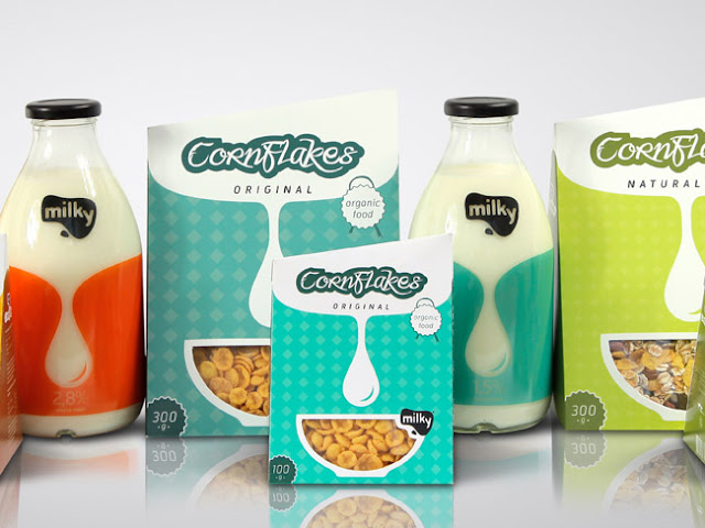
I chose this line of packaging as an example of good design. It was designed by Matija Blagojevic, a graphic design student from Serbia. When I came across this packaging, I thought it was a great design, very modern and clean. The package I want to focus on specifically is the CornFlakes Original cereal package. Below are a few of examples of the Gestalt Principles I noticed in this package.
- Simplicity: This cereal package is very clean and simple. There aren't too many colors going on, and there are only a few objects in the design as well.
- Proximity: You can see the diamond shape pattern in the background. This is an example of proximity. Each of the diamond shapes are placed close enough together to create a pattern.
- Similarity: If you look closely, you can see that the two circle shapes in each corner ("organic food" & "300g") are the same exact circle, just opposite colors.
Here is an ordinary cereal box, "Cheerios". In my opinion, this is an example of bad design, especially when compared to the new and modern design of "Milky". A few reasons why I think this Cheerios box is bad design are...

- There are too many objects competing against each other. When I first looked at the box, my eye kept jumping back between the "Free Gratuit", the "Cheerios" heading, and the "1g of sugar". Then you also have the picture of yogurt on the side which is distracting to the product.
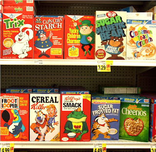
- I feel that the overall feel and color scheme of the package does not stand out from it's competitors. To the right is a photo of the cereal section at a grocery store. Notice how similar all of the cereal boxes look in terms of color, size, graphics, etc.
If I was walking down the grocery store aisle, I would probably skim over the Cheerios box, but the "Milky" packaging would stand out from all of these bland, out-dated packages. Now days, design is becoming less and less cluttered, and the simpler the package or design is, the more it stands out and gets noticed!
This photo is a good example of contrast, as well as balance and harmony. The first thing I notice in this photo is the contrast of color between the blueish-gray mountains and the yellow-orange trees. I also feel that there is contrast of the textures between the the soft trees and the sharp mountains.
This photograph also exemplifies balance. In some ways, I feel this photo has symmetrical balance because of the reflection on the lake. It is almost a mirror image of the top half of the photo, and the bottom half. That being said, I think it could also be asymmetrical because there is so much variety in the mountains and trees. There are different colors, shapes, heights, etc.
Last but not least - harmony. You can see and feel harmony in this picture because everything is in place. There isn't a strange object or something that doesn't belong in the photo. Because of the reflection, you have the same colors repeating throughout the image which also brings harmony.


